
Bold Typography Vs Minimalist Fonts: Which Is Better For Your 2026 Projects?
Let's settle this once and for all. After spending years watching design trends swing like a pendulum between "less is more" and "more is more," 2026 has delivered its verdict: bold typography is absolutely crushing it.
But before you go deleting every clean sans-serif from your font library, let's dig into why this shift is happening and when each approach actually makes sense for your projects.
The Great Typography Rebellion of 2026
We've officially reached peak minimalism fatigue. After a decade of safe, stripped-back sans-serifs dominating everything from app interfaces to billboard campaigns, designers are staging a full-blown typographic rebellion.
The numbers don't lie. Bold, expressive typography now leads 73% of major brand refreshes this year, and oversized, unapologetic fonts are showing up everywhere from luxury fashion campaigns to fintech startups. But this isn't just about being loud for the sake of it: there's genuine strategy behind the shift.
Why Bold Typography Is Having Its Moment
Visual Fatigue from Sameness
Here's the uncomfortable truth: we got bored. After years of every brand looking like a carbon copy of the same minimalist template, consumers developed what design psychologists call "aesthetic blindness." When everything looks the same, nothing stands out.
Bold typography breaks through this noise because it forces an emotional reaction. Whether it's a chunky serif that feels like it was carved from stone or a geometric sans that practically shouts from the page, expressive fonts demand attention in ways that quiet minimalism simply can't match.
The Personality Revolution
Minimalism promised clarity and sophistication, but somewhere along the way, it also stripped away personality. Bold typography brings character back into the conversation. A well-chosen expressive font can communicate wit, confidence, playfulness, or authority before anyone reads a single word.
Typography as Hero Element
Perhaps the biggest shift is how typography functions in modern design. Instead of being a supporting player, bold fonts now take centre stage as the primary visual element. Think less "background text" and more "sculptural focal point."
When Bold Typography Absolutely Wins
Brand Differentiation Projects
If you're working on anything that needs to stand out in a crowded market, bold typography is your secret weapon. Whether it's a startup trying to disrupt an established industry or an established brand fighting for attention, expressive fonts create instant memorability.
Emotional Storytelling
Bold typography excels when you need to convey feeling rather than just information. A chunky, hand-lettered headline can communicate warmth and authenticity in ways that pristine minimalism never could. It's the difference between being heard and being felt.
Social Media and Digital Marketing
Here's where bold typography really shines. On platforms where you have milliseconds to grab attention, oversized, personality-packed fonts perform dramatically better than their minimal counterparts. They're more likely to stop the scroll, generate engagement, and stick in memory.
Premium Positioning
Counterintuitively, bold typography often signals higher quality and craftsmanship than minimalism. There's something about expressive fonts that suggests human creativity and intentional design choices, which consumers increasingly associate with premium experiences.
When Minimalist Fonts Still Make Perfect Sense
Before you completely abandon clean, minimal typography, remember that context is everything. Minimalist fonts still dominate in several crucial scenarios.
Information-Heavy Projects
When readability trumps personality: think technical documentation, financial reports, or educational content: minimal fonts remain unbeatable. They reduce cognitive load and help users process complex information without distraction.
Timeless Brand Positioning
Some brands benefit from appearing stable and enduring rather than trendy and bold. Financial institutions, healthcare providers, and luxury brands that emphasise heritage often find minimalism more aligned with their positioning goals.
Mobile-First Experiences
Whilst bold typography works brilliantly for hero sections and key messaging, minimalist fonts often perform better for body text and navigation on smaller screens. They're simply easier to read at smaller sizes and lower resolutions.
The 2026 Typography Playbook
Mix and Match Strategically
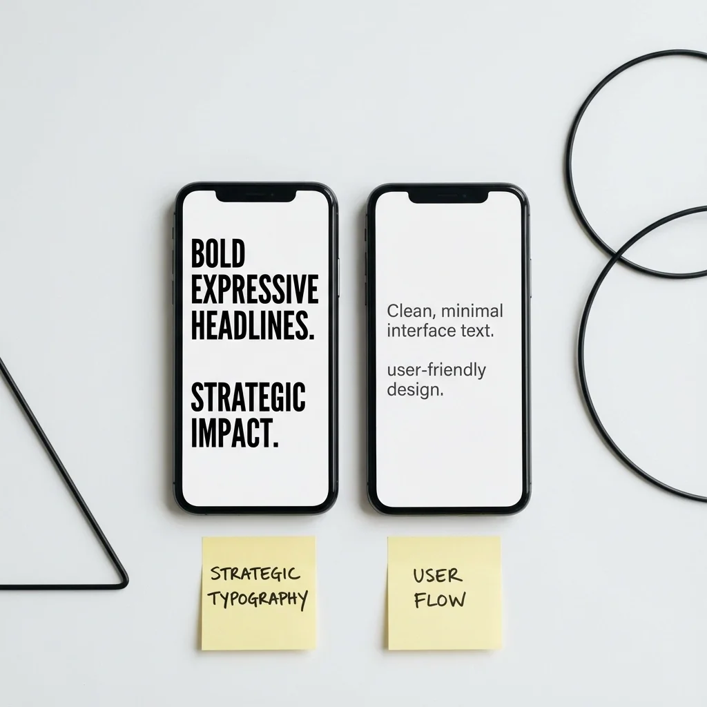
The smartest designers aren't choosing sides: they're creating typographic hierarchies that combine both approaches. Bold, expressive fonts for headlines and key messages, paired with clean, minimal fonts for supporting text and user interface elements.
Consider Your Audience's Context
Bold typography works brilliantly when your audience expects to be entertained or inspired. Minimal fonts work better when they're trying to accomplish specific tasks or process important information.
Test for Performance, Not Just Aesthetics
Beautiful typography means nothing if it doesn't perform. A/B test your typographic choices across different contexts: email subject lines, social media posts, landing page headlines: and let data guide your decisions alongside design intuition.
Making It Work in Practice
Start with Brand Personality
Before choosing between bold and minimal, define what your brand actually stands for. Are you the reliable advisor or the bold disruptor? Your typography should amplify your brand's core personality, not fight against it.
Think Beyond the Font File
Typography isn't just about the letterforms: it's about size, spacing, colour, and context. A minimalist font displayed at massive scale with generous spacing can feel as bold as any expressive typeface. Similarly, a bold font used thoughtfully at smaller sizes can feel surprisingly elegant.
Budget for Quality
Whether you're going bold or minimal, invest in professional fonts from reputable foundries. Free alternatives rarely offer the same level of craftsmanship, and your audience will notice the difference, even if they can't articulate why.
The Real Answer: It's Not Either/Or
Here's what the most successful 2026 projects understand: the bold versus minimal debate misses the point entirely. The real question isn't which style is "better": it's which approach serves your specific project goals most effectively.
Bold typography dominates 2026 because brands need to break through more noise than ever before. But minimalism remains powerful when clarity, trustworthiness, and timeless appeal matter most.
The brands winning in 2026 understand that typography is a strategic tool, not just an aesthetic choice. They're using bold fonts when they need to disrupt expectations and minimal fonts when they need to build trust. They're mixing approaches within single projects to create sophisticated visual hierarchies that guide users through complex information whilst maintaining emotional engagement.
Rather than asking whether bold or minimal is "better," start asking which approach helps your audience feel the way you want them to feel and do the things you need them to do. That's where real design success lives: not in following trends, but in understanding how typographic choices create human connection.
The future belongs to designers who can wield both approaches strategically, knowing exactly when to whisper and when to shout.